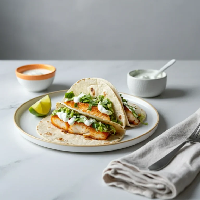

Or shall we call it ‘The Richards’ ?! Instead of ‘The Champagne Oscars’ ? We want to sum-up the year of 2025 from a Champagne perspective. In 20+ categories we hand out awards for this years most memorable Champagnes & Champagne related topics! [ read the full champagne story ]
Estimated reading time: 6 minutes
Historical Winners
| 2025 | Agrapart Avize |
| 2024 | Lérôme Lefèvre [ Delalot & Maison Jérôme Lefèvre ] |
| 2023 | – |
| 2022 | Valentin Leflaive – Oger |
| 2021 | – |
| 2020 | Charles Dufours champagnes – Landreville |
To judge the “Best Champagne Label Design of the Year,” one must look beyond simple aesthetics. Champagne is a category steeped in rigid tradition, so the best designs often walk a tightrope between honoring that heritage and disrupting it.
Here are the five critical criteria I would use to judge the award, ranked by importance in today’s luxury market.
1. The “10-Foot” Impact (Visual Hierarchy)
Before a consumer touches the bottle, the label must communicate the brand’s essence from a distance.
- differentiation: Does it stand out in a “sea of gold”? If it’s a Blanc de Blancs, does it look crisp and bright? If it’s a Vintage, does it look dark and serious?
- Typography: Is the font legible but distinct? Great typography in Champagne often mixes traditional serif fonts (implying history) with modern sans-serifs (implying freshness).
- The “Collar” Integration: The collerette (neck label) is unique to sparkling wine. A winning design integrates this seamlessly with the main body label rather than treating it as an afterthought.
2. Tactility & Craftsmanship (The “Touch” Test)
Champagne is a luxury good; holding the bottle is part of the experience. A flat, glossy sticker feels cheap.
- Texture: Top-tier labels use heavy, textured paper stocks (cotton, linen) that feel substantial under the thumb.
- Embellishment: The judicious use of foil stamping (gold/silver), embossing (raised textures), and varnish. The criterion here is restraint. Too much gold looks tacky; just enough looks expensive.
- Paper Quality: Does the label hold up when chilled? A design fails if it bubbles or peels off in an ice bucket (the “Ice Bucket Challenge”).
3. Narrative & “Terroir” Transparency
This is the most rapidly growing criterion. Modern drinkers want to know what they are drinking, not just the brand name.
- Storytelling: Does the design tell you who made it? A Grower Champagne (small farmer) should feel artisanal and personal. A Grand Marque (big house) should feel timeless and consistent.
- Data Density: For the “Best Design” in 2025/2026, the label must elegantly include technical details without looking cluttered:
- Dosage (sugar level)
- Disgorgement date
- Village/Cru classification
- Success Indicator: Can I read the “technical specs” without feeling like I’m reading a spreadsheet?
4. Innovation in Sustainability
We can no longer award “Best Design” to a bottle that is an environmental disaster.
- Eco-Design: Is the paper FSC-certified? Are the inks organic?
- Foil Reduction: Many modern designs are minimizing or removing the neck foil (the coiffe) entirely to reduce waste. A winning design makes this “naked” look intentional, not unfinished.
- Recyclability: Does the label use adhesives that wash off easily during recycling?
5. Emotional Resonance (The “X-Factor”)
Finally, does the bottle make you feel something?
- Celebration: Champagne is rarely opened for a sad occasion. The design must capture the energy of celebration—whether that is loud and festive (like Moët & Chandon) or quiet and intimate (like Jacques Selosse).
- Cohesion: Do the bottle shape, the foil color, and the label shape all work together?
Comparison of Design Philosophies
| Feature | Traditional (Grand Marque) | Modern (Grower/Artisanal) |
| Primary Goal | Consistency & Luxury Status | Personality & Transparency |
| Typography | Classical Serif, Script | Minimalist Sans-Serif, Typewriter |
| Material | Gold Foil, Glossy Varnish | Matte Paper, Textured, Recycled |
| Information | Brand Name is King | Terroir/Vintage is King |
| Example | Louis Roederer, Bollinger | Agrapart, Ulysse Collin |
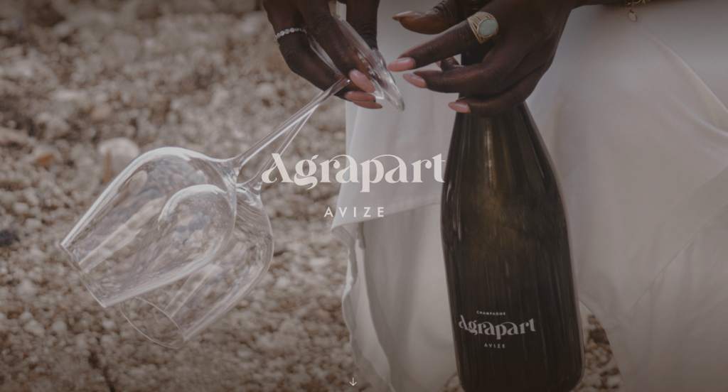
Here is the analysis of your uploaded image, Agrapart “Atoma”, based on the five criteria for “Best Label Design” defined above.
This is a prime example of the modern “Grower Champagne” aesthetic that is currently redefining luxury.
Rating: Agrapart “Atoma”
1. Visual Hierarchy (The “10-Foot” Impact)
- Verdict: Distinctive Minimalism.
- Analysis: In a category often dominated by gold and excessive ornamentation, this bottle “screams” by whispering. The dark, almost “black” profile makes it stand out immediately on the shelf. The typography is modern and stripped back. The “AAA” logo (referencing the new era for Agrapart Avize) acts as a cryptic symbol that sparks curiosity rather than just stating a brand name.
2. Tactility & Craftsmanship (The “Touch” Test)
- Verdict: Direct Contact.
- Analysis: The design appears to use screen printing directly on the glass (or an ultra-thin transparent label). This is a major trend among top growers. It removes the paper barrier between the consumer and the wine. When you hold the bottle, you are touching the glass and the content directly, creating a sense of purity and transparency—much like the wine inside (Blanc de Blancs).
3. Narrative & Transparency
- Verdict: “A Grape Art”.
- Analysis: The name “Atoma” refers to an “atom,” the smallest constituent unit, reflecting winemaker Fabrice Agrapart’s philosophy regarding this cuvée (a blend of vintage wine and a “perpetual reserve”). The design communicates this “scientific” yet natural approach. It is clear that this is not a mass-produced product, but a personal work from a specific place (Avize).
4. Innovation in Sustainability (Eco-Luxury)
- Verdict: Full Marks (The Naked Neck).
- Analysis: This is the bottle’s strongest design element. Agrapart has chosen to remove the coiffe (the foil around the neck) entirely.
- This showcases the cork and the muselet (wire cage) as part of the design.
- It immediately signals “Natural Wine” and sustainability to the modern consumer.
- It reduces unnecessary waste (metal/plastic) without making the bottle look “unfinished,” thanks to the elegant paper strip stamp that seals the cork.
5. Emotional Resonance (The “X-Factor”)
- Verdict: Intellectual Luxury.
- Analysis: The bottle does not feel festive in the traditional “spraying champagne” sense. It feels serious, gastronomic, and intellectual. It is a bottle you place on the table to discuss, not just to drink. It signals to guests: “I know champagne, and I care about the craft.”
Conclusion
If I were to give an award for “Best Sustainable Luxury Design,” Agrapart “Atoma” would be a top contender. It proves that one can remove the traditional “luxury marker” (the gold foil) and still create a product that looks more expensive and exclusive than its competitors.